Earlier this week I posted an entry about using FetchXML and JQuery in a Dynamics CRM 2011 web resource. The reason I first started looking at those two together was that I wanted to see if I could generate better looking line charts than are available out of the box (spoiler alert: I did). In this post I will show how to combine FetchXML and JQuery with the Flot plotting library to produce line charts from CRM data aggregations.
In my career, one of the data visualizations I have encountered the most is to plot some value over unit time. For example, we can try to measure an agent's productivity by counting the number of phone calls per day. Because of the way Dynamics CRM stores data, if we restrict our queries to its database instead of a data warehouse, generally we can report on actions taken per unit time, but we can't report on how things change over time. We can say Agent X created 100 phone call records last week, but we can't tell how many overdue phone call records Agent X had in the queue yesterday. In my example here, I will show how to plot number of contacts created per day.
Top of the page stuff
Charting with Flot requires jQuery, Flot (obviously) and Excanvas in Internet Explorer. Here is how I pull those libraries in from CDNs, but if your CRM instance is accessed over a LAN, you should host them locally.
<!--[if lte IE 8]><script language="javascript" type="text/javascript" src="https://cdnjs.cloudflare.com/ajax/libs/flot/0.7/excanvas.min.js"></script><![endif]-->
<script src="https://ajax.aspnetcdn.com/ajax/jQuery/jquery-1.9.0.min.js"></script>
<script src="https://cdnjs.cloudflare.com/ajax/libs/flot/0.7/jquery.flot.min.js"></script>
Also, Flot doesn't work so well in Internet Explorer quirks mode, so make sure you set the page to display in standards mode by declaring an HTML doctype like so in the first line:
Writing the query
As I explained previously, if you want to query aggregate data from inside JavaScript, you have to use FetchXML. While researching this topic, the examples I found weren't necessarily the clearest, but MSDN has a good overview here.
Once you get the hang of the FetchXML syntax, if you can write your query in SQL group-by syntax, it shouldn't be too difficult to translate it to FetchXML. Here is the query we will use to count contacts by their createdon date:
<fetch distinct='false' mapping='logical' aggregate='true'>
<entity name='contact'>
<attribute name='fullname' alias='plotValue' aggregate='count' />
<attribute name='createdon' groupby='true' dategrouping='day' alias='day' />
<attribute name='createdon' groupby='true' dategrouping='month' alias='month' />
<attribute name='createdon' groupby='true' dategrouping='year' alias='year' />
</entity>
</fetch>
We have a single data field aliased as plotValue that is equivalent to SQL's count(fullname) as plotValue, and then there are three groupby fields that are based on the createdon field. They have each been given an alias that corresponds to the specific datepart.
Executing the query
To execute the FetchXML and retrieve the results, we will use the same basic technique I showed in my previous post.
- Get FetchXML query from a textarea field.
- Build a SOAP message.
- Send the SOAP message to CRM and register a callback function to process the data.
To do this, we will use the same function executeFetchCommand, buildFetchRequest and sendQuery methods from my previous post. We will be using a different processData method, though the name will stay the same.
Charting the data
Once the data is returned by CRM, we can generate the chart. To do that, we will do the following:
- Loop through XML to extract count for each date.
- Convert the count and date values to an array of X and Y values for Flot to plot.
- Call the Flot plotting method.
- Bind an event to our chart to display tooltip messages that show the X and Y values when the user mouses over a specific point.
First, our new processData callback function looks like this:
function processData(xml) {
/// <summary>
/// charts data returned in a FetchXML response using Flot
/// </summary>

alert("Charting started");

//create a label for the chart points
var yLabel = "Contacts created";

//create an array to hold the plot data
var series1 = [];

//loop through xml and extract data from each "entity" element
$("#chartdiv").append("Starting XML parsing . . . <br />");
$(xml).find("a\\:Entity").each(function() {
//pass the element to a function that extracts the aggregate value and the "group by" values
//"plotValue" is the FetchXML alias for the data we want to display
var pointData = getKeyValPairs($(this),"plotValue");

//Flot requires datetimes to be passed as timestamp values
var dateString = (pointData[1].year + "-" + pointData[1].month + "-" + pointData[1].day).replace(/,/g,'');
var timestamp = new Date(pointData[1].year.replace(/,/g,''), parseInt(pointData[1].month)-1, pointData[1].day).getTime();

//add x (timestamp) and y (aggregate data value) values to the data series array
series1.push([timestamp, pointData[0]]);
});

//sort series array by date - Flot plots in order, so line can look wrong if we don't do this
series1.sort(function(a,b){return a[0]-b[0];});

//plot the data with some display options
//see examples and API documentation at http://www.flotcharts.org/
$.plot($("#chartdiv"),
[ { data: series1, label: yLabel} ], {
series: {
lines: { show: true },
points: { show: true }
},
grid: { hoverable: true },
xaxis: {
tickSize: [1, "day"],
mode: "time",
timeformat: "%m/%d/%y"
}
}
);

alert("Charting complete");
}
In this method first we loop through the data and pass each element to a getKeyValPairs helper function to extract the necessary fields. It returns an array with the Y value to plot as element 0 and a JSON object containing all other fields as element 1. It looks like this:
function getKeyValPairs(entity, valuefield) {
/// <summary>
/// extracts an aggregate value and grouping components from a FetchXML response entity element and returns them in an array
/// </summary>
var outputArray = new Array();

//first get the aggregate value using its alias ("plotValue" in the original example)
var pointValue = parseFloat(entity.find("a\\:KeyValuePairOfstringstring").filter(function() {
return $(this).find('b\\:key').text() == valuefield;
}).find("b\\:value").text().replace(/,/g,''));
var groupingArray = [];
entity.find("a\\:KeyValuePairOfstringstring").filter(function() {
return $(this).find('b\\:key').text() != valuefield;
}).each(function() {
var xmlElement = $(this);
var key = xmlElement.find("b\\:key").text();
var value = xmlElement.find("b\\:value").text();
var groupingText = '"' + key + '":"' + value + '"';
groupingArray.push(groupingText);
});
var stringToEval = groupingArray.join();
var dateFields = eval("({"+stringToEval+"})");
outputArray.push(pointValue);
outputArray.push(dateFields);

return outputArray;
}
Once the data fields are returned by they getKeyValPairs method, the processData function creates a timestamp from the supplied month, day and year fields (Flot requires timestamps to plot by datetime), and then adds the timestamp and count to an array.
After the loop is complete, we sort the array by date to make sure the line will be plotted along our points in the correct order. Finally we call the Flot plot function with the data array and some pre-determined options. There are a lot of cool configuration options you can specify for Flot plots, but explaining them is beyond the scope of this point. Please take a look at the Flot examples page for more.
Finally we need some code to do the tooltip display. First we have a generic showTooltip method that will be executed when the mouse moves over a data point. You can customize the style to your liking.
function showTooltip(x, y, contents) {
/// <summary>
/// function to show tooltip when user mouses over data points
/// </summary>
$('<div id="tooltip">' + contents + '</div>').css( {
position: 'absolute',
display: 'none',
top: y + 5,
left: x + 5,
border: '1px solid #fdd',
padding: '2px',
'background-color': '#fee',
opacity: 0.80
}).appendTo("body").fadeIn(200);
}
Then we have code that binds a function to the chart plothover event so that the showTooltip method gets executed at the right time with the right data:
//bind a function to execute the showTooltip function at the appropriate time
var previousPoint = null;
$("#chartdiv").bind("plothover", function (event, pos, item) {
$("#x").text(pos.x.toFixed(2));
$("#y").text(pos.y.toFixed(2));

if (item) {
if (previousPoint != item.dataIndex) {
previousPoint = item.dataIndex;

$("#tooltip").remove();
var date = new Date(item.datapoint[0]);
var x = item.datapoint[0].toFixed(2),
y = item.datapoint[1];

//call showTooltip with the timestamp converted back to mm/dd/yyyy format
showTooltip(item.pageX, item.pageY,
item.series.label + " on " + (parseInt(date.getMonth()+1)) + "/" + date.getDate() + "/" + date.getFullYear() + " = " + y);
}
}
else {
$("#tooltip").remove();
previousPoint = null;
}

});
Trying it out
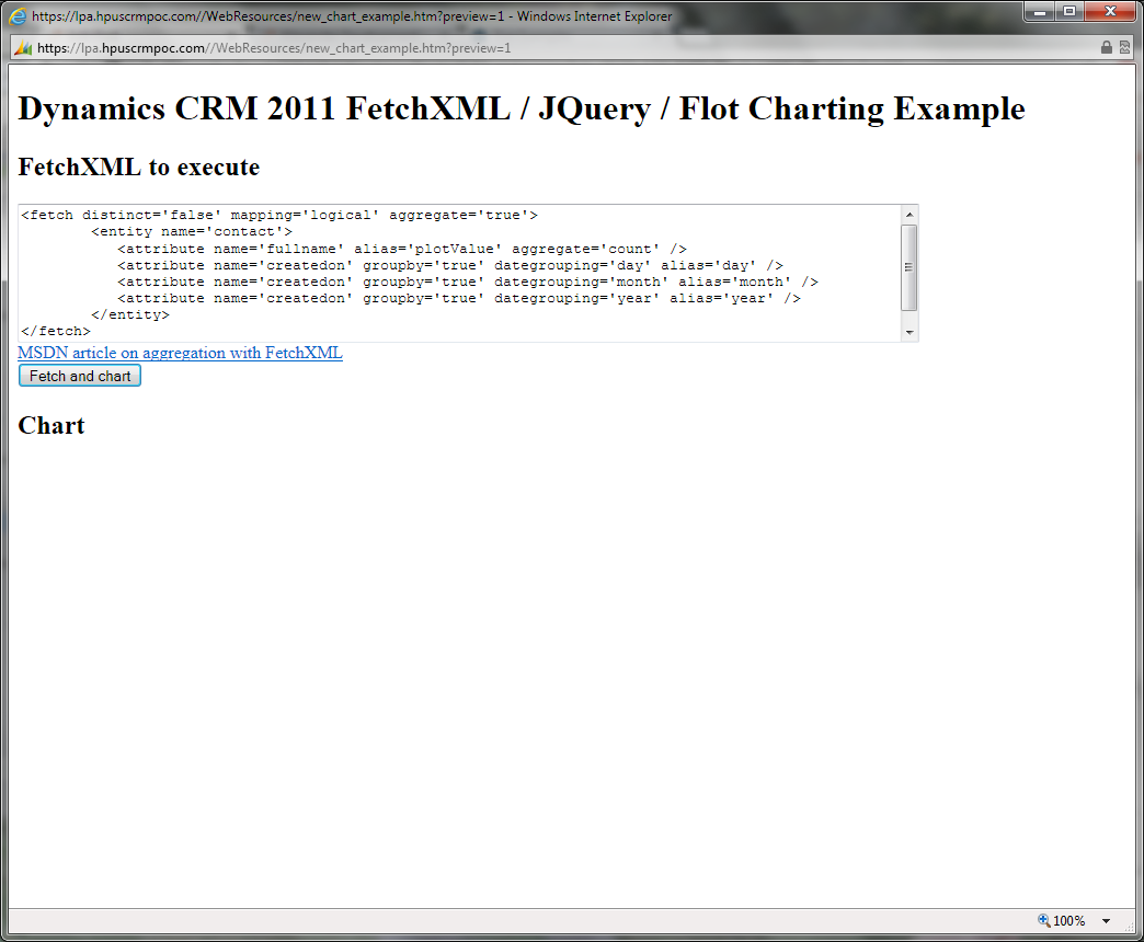
Here is a complete web page with the code for you to download and try out in your own CRM instance chart_example.htm (8.30 kb). Just upload it as you would any other web resource, publish and open. At that point you will be presented with a screen that looks like this:
Either leave the pre-populated FetchXML in the textarea or supply your own that does a count by month, day and year. As long as it returns those three group-by fields and a Y value aliased as "plotValue," it should work. Once you click the "fetch and process" button, you will start to see some output and a couple of status alert windows before the output finally displays. The end result should look like this:
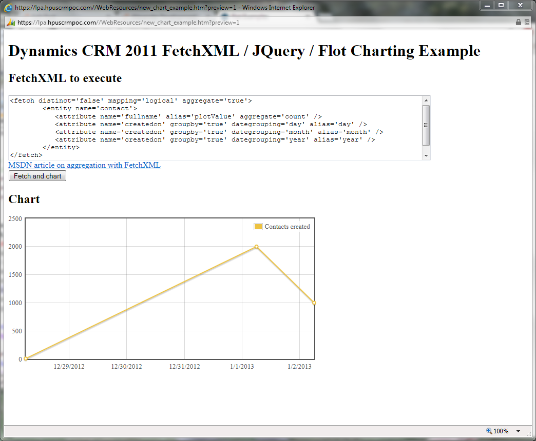
Of course this chart is actually not that exciting, but once you take a closer look at how you can format the line chart output with Flot, you'll see there are all sorts of interesting things you can do. You can also embed the charts in dashboards as a replacement for the existing Dynamics CRM line chart controls. Stay tuned for my next post when I show how to generate multi-series charts.